Western Producer
Publication Redesign & 100th Anniversary Game
Modernized Canada's oldest agricultural publication, redesigning article pages, category layouts, and building an entirely new markets experience. Then designed a gamified anniversary app that hit 16-minute engagement in one month.
Publication Redesign
Modernizing a 100-year-old digital experience
01The Challenge
Western Producer is Canada's oldest agricultural publication, serving Prairie farmers since 1923. The digital platform carried decades of legacy design decisions: cluttered layouts, ad-heavy article pages, and a markets experience that hadn't evolved with how farmers actually consume commodity data.
As the sole UX/UI designer, I was responsible for modernizing the entire digital experience (article pages, category layouts, the markets section, digital edition browsing, and subscription management) without alienating a loyal readership that values function over novelty.
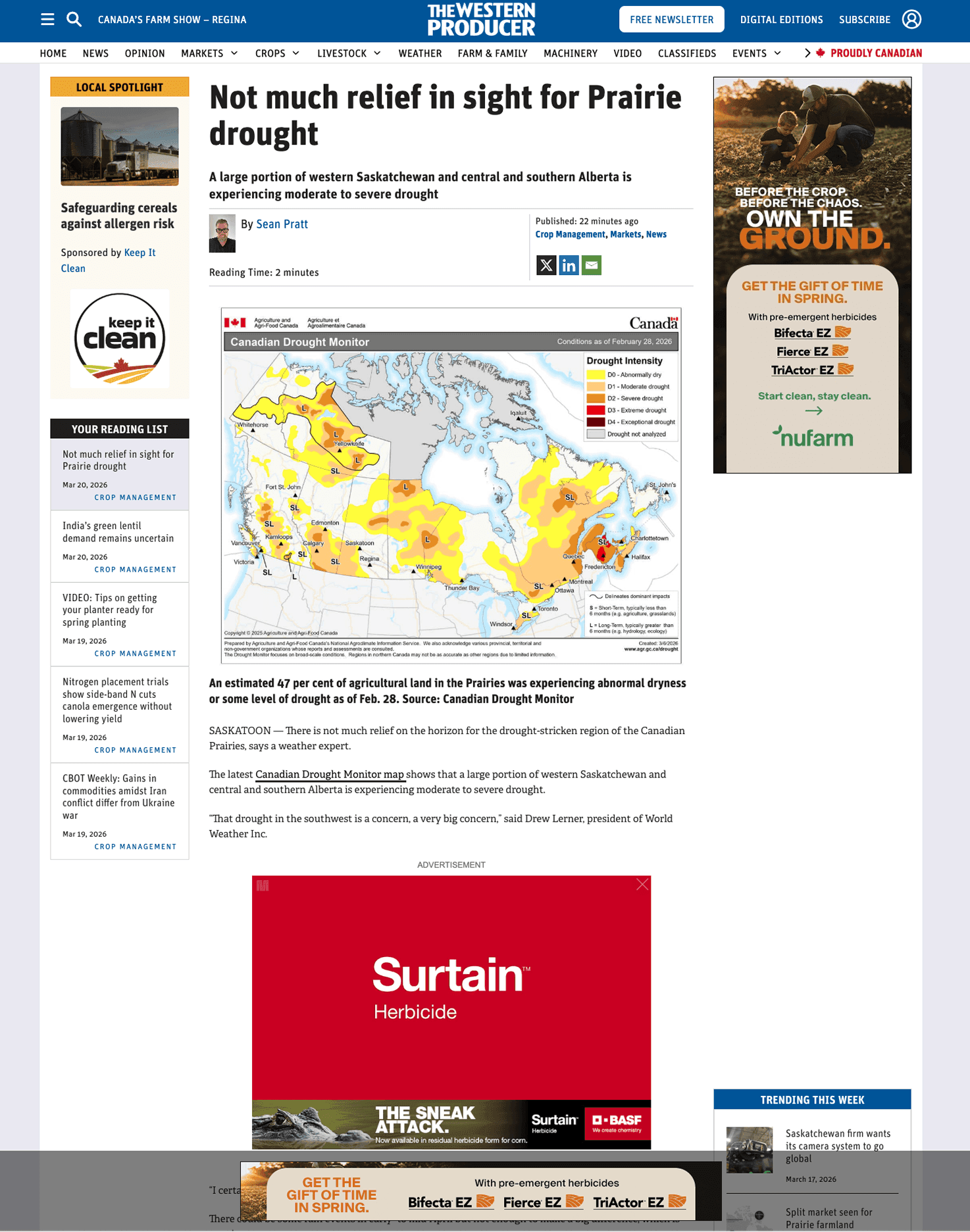
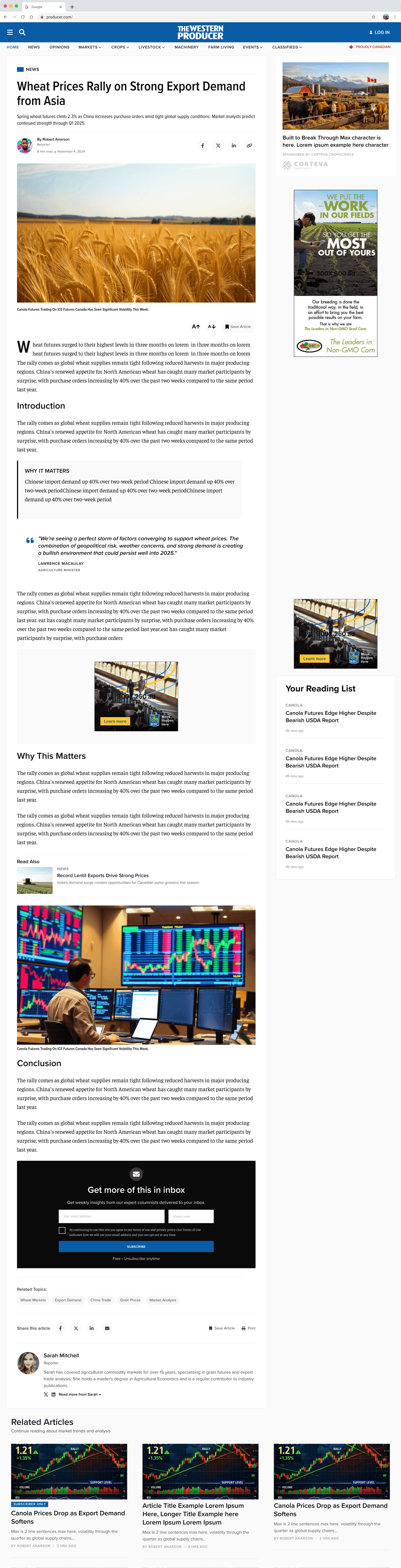
Stripped away the clutter (ad-heavy sidebars, competing widgets, and dense layouts) and replaced it with a clean reading experience. Full-width hero imagery, proper typography hierarchy, structured “Why This Matters” sections, and a reading list that keeps users engaged without overwhelming the primary content.
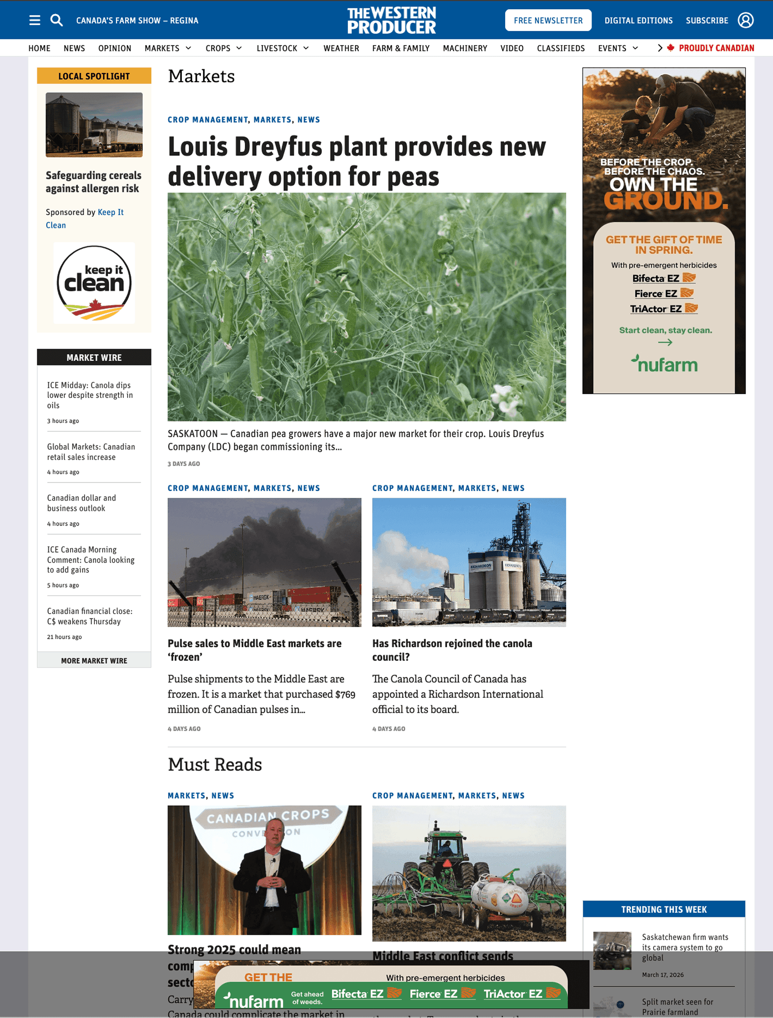
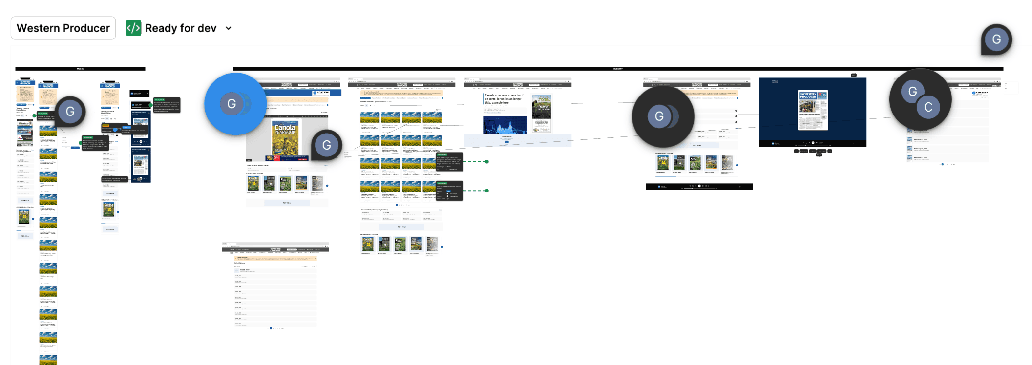
Category pages were flat article lists with no visual hierarchy. Redesigned them with a featured story hero, trending content grid, and structured sections, giving editors a layout that highlights what matters while staying scannable for farmers who check these pages daily.
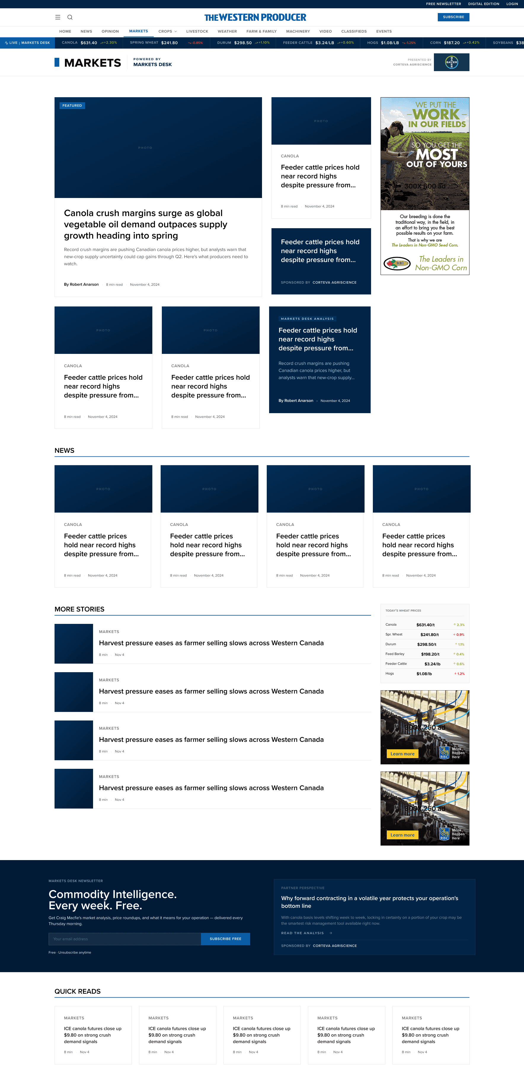
The markets section is the most-visited part of Western Producer. Farmers check commodity prices the way traders check stocks. Designed an entirely new experience from scratch: information architecture, user flows for different commodity types, and responsive layouts that give farmers real-time price data, trend charts, and market news in one unified view.
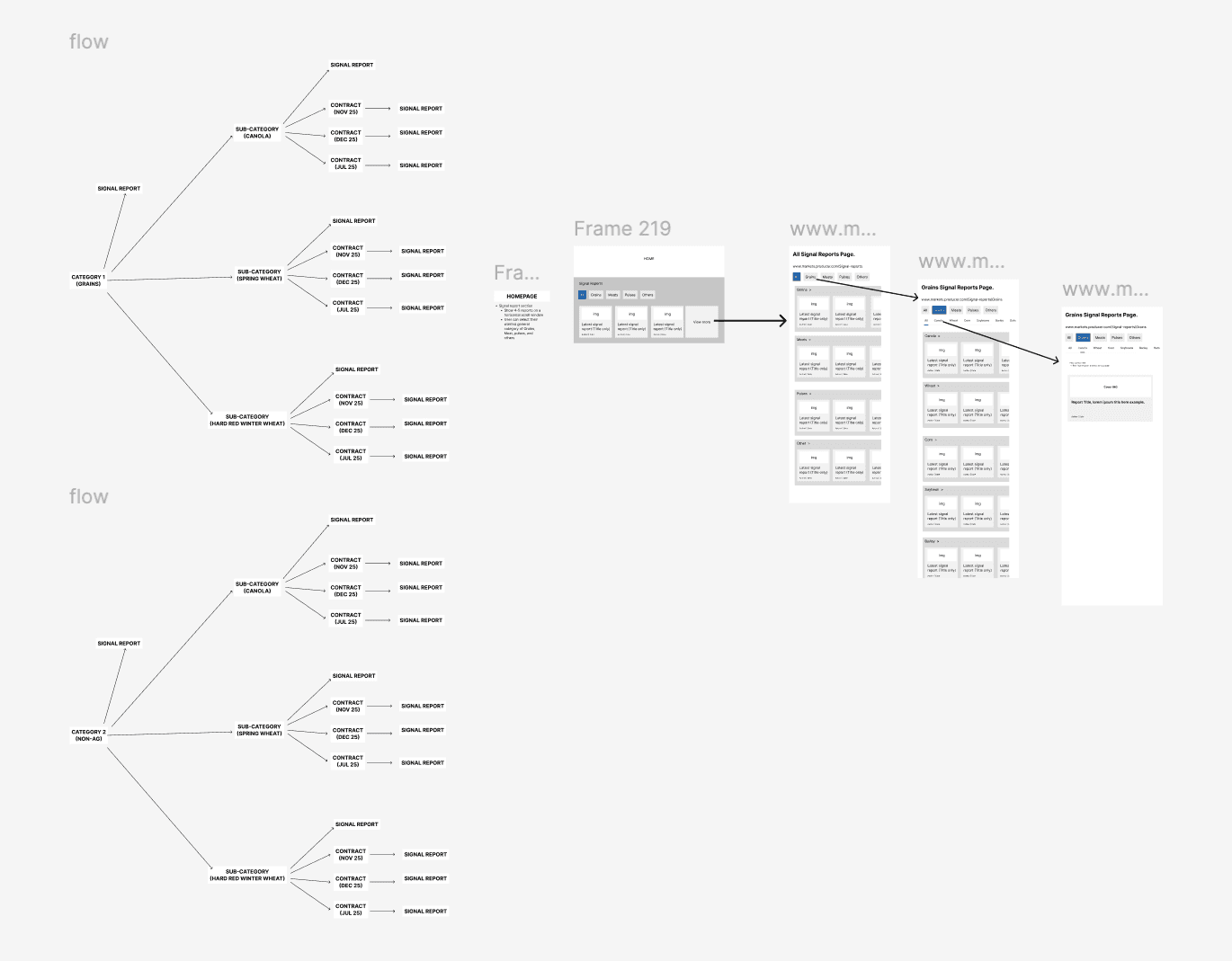
Information architecture, user flows, mobile screens, and desktop layout
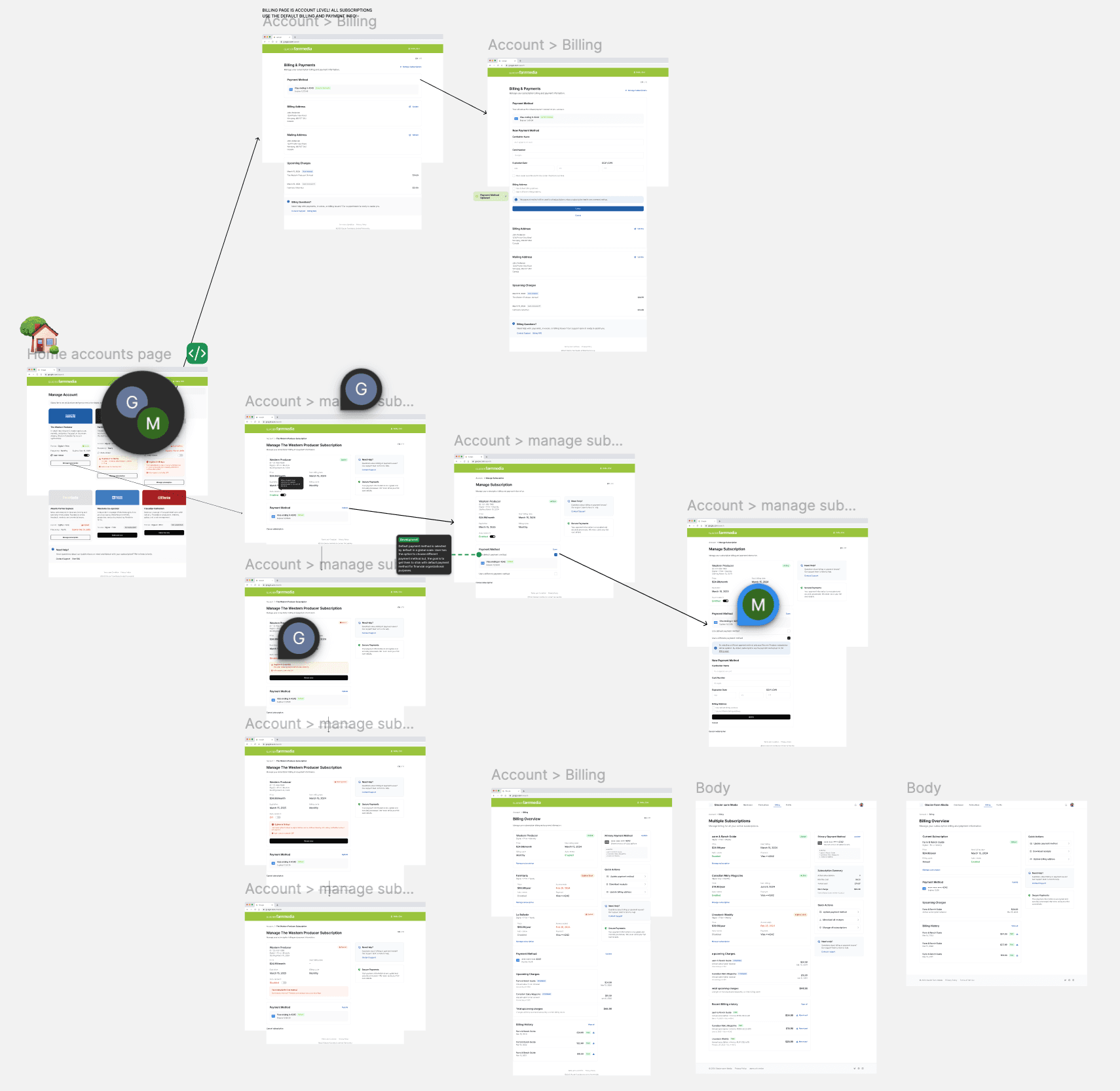
Redesigned the digital edition browsing experience, transforming a basic PDF viewer into a scannable, browsable format. Streamlined subscription billing and account management from a confusing multi-page flow into clear, straightforward states.
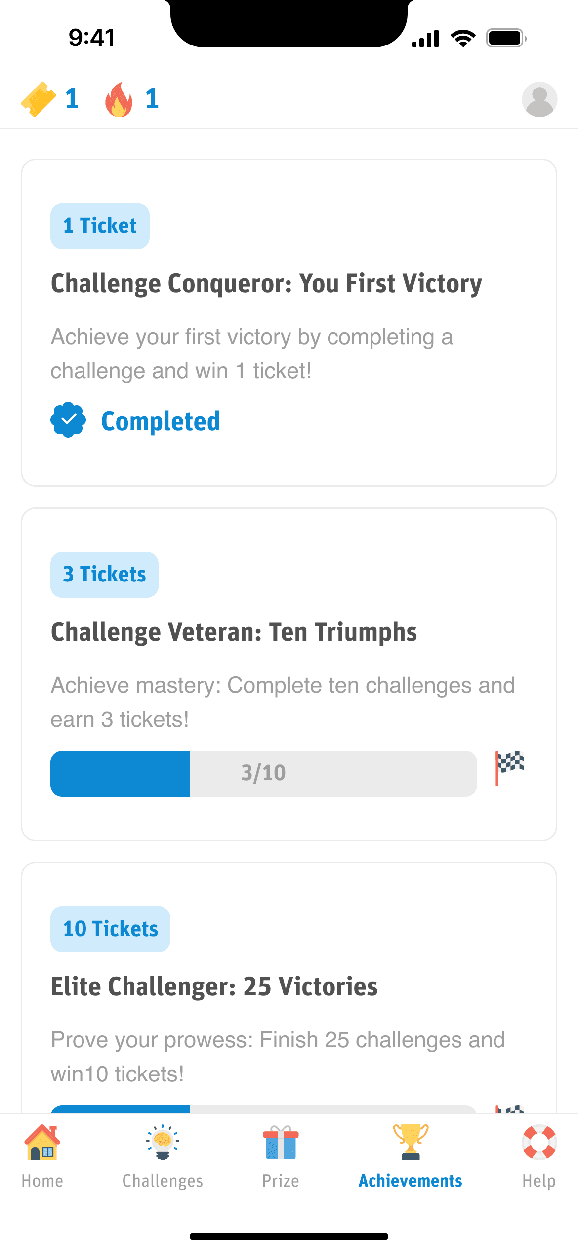
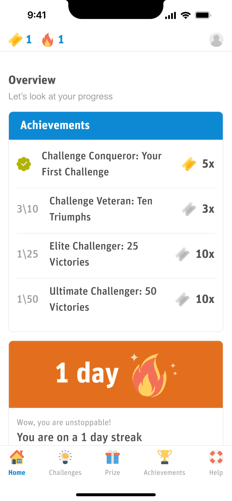
100th Anniversary Challenge
A gamified reading app, designed and shipped in one month
06The Brief
For Western Producer's 100th anniversary, the brief was to design something that celebrated a century of agricultural journalism, not with a retrospective, but with an experience that made farmers actively engage with the content.
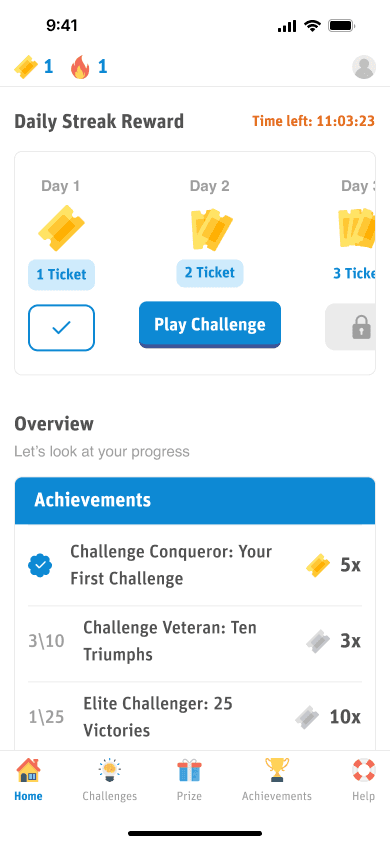
The constraint: one designer, one developer, one month. The result: a gamified daily-challenge app where farmers read articles to find hidden clues, earn points, and compete for prizes.
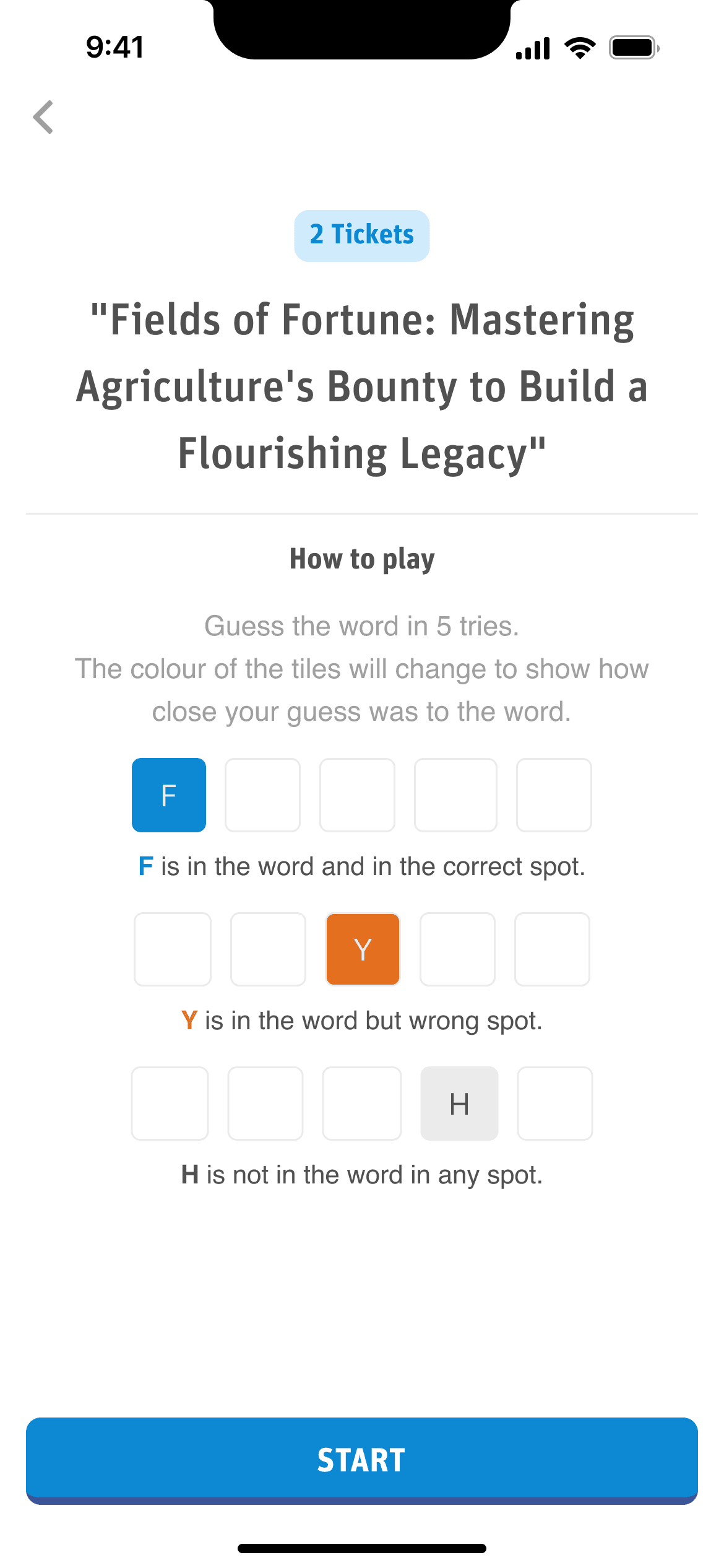
16 min
In an industry where 2-minute sessions are the norm, farmers were spending 16 minutes per session reading articles and hunting for clues. The content was the game.
07Key Decisions
08Results
16 min
Avg Game Engagement
Daily
Return Frequency
100 yrs
Content Leveraged
1 month
Game: Design to Launch
1 Designer
+ 1 Developer
5+
Pages Redesigned
09Tools & Methods
10What I Learned
Western Producer taught me that redesigning for a loyal audience is harder than designing from scratch, and that the best gamification doesn't feel like a game.
On the publication side, every change had to earn its place. Farmers who've read Western Producer for decades notice when their reading list moves, when the article layout shifts, when the markets page loads differently. The redesigns couldn't be change for change's sake. They had to make the daily workflow measurably better while respecting the muscle memory of a loyal readership.
On the Challenge app, the insight was simpler: farmers weren't opening the app because they liked games. They opened it because they had a challenge waiting, and the challenge happened to involve reading something interesting. The 16-minute engagement wasn't clever mechanics. It was because the content was genuinely worth reading, and the game just gave people permission to spend time with it.
Interested in working together?
I design products that ship, and prove their value with real metrics.
Get in Touch